Wednesday 26 October 2016

Going skin tone crazy in more mediums than one

Westworld has become my favourite ongoing science fiction series and is now tied with fantasy series Game of Thrones as still-in-progress television series that I most like. As with any inspirational shows, I tend to either draw or paint the main characters which in this case are Dolores Abernathy (played by Evan Rachel Wood) and Daenerys Targaryen (by Emilia Clarke). These two actresses are going to make excellent subject matters for my coloured pencil (and probably graphite too) portrait practice sessions. While watching Westworld through a semi-hatchet job by local television censors isn't ideal, it'll have to do until HBO releases the Bluray version of this awesome series.            

Skin Tone Study 01: Evan Rachel Wood under warm lighting (left) and daylight (right)
Skin Tone Study 02: Emilia Clarke under overcast lighting (left) and daylight (right)

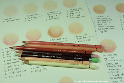
For my coloured pencil portrait drawings, I'm doing skin tone studies to find out the right mix of hues to achieve the fairly light skin tones that both actresses have. It involves the use of both oil-based and wax-based artist grade coloured pencils namely Faber-Castell Polychromos, Derwent Coloursoft and Prismacolor Premier. For these studies, I've started incorporating green hues into the mix as strong green undertones can be visibly seen in both actresses' facial skin tones. Whether this natural green undertone is more prominent due to specific makeup and set lighting I can't really say. But it's worth noting green foundation has always been used by the old masters to depict realistic skin tones.

Derwent Coloursoft wax-based coloured pencils and Faber-Castell Polychromos oil-based ones
Light skin tone swatches with Coloursoft and Polychromos pencils
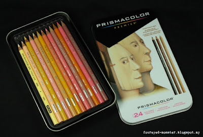
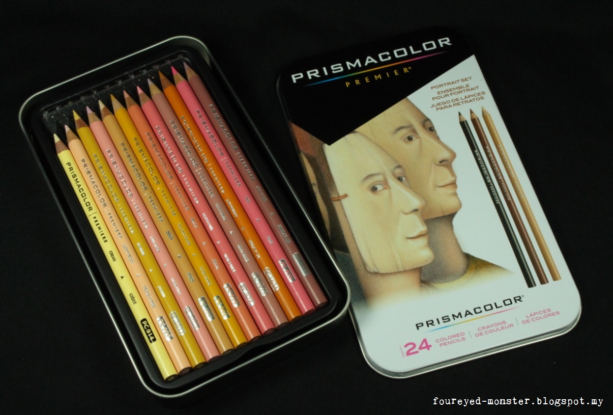
Prismacolor Premier wax-based coloured pencils - 24 pieces portrait set
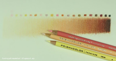
A skin tone bar using Prismacolor Premier pencils (based on a tutorial by artist Ann Kullberg)

For the time being most of my coloured pencil portraits will be drawn on the Strathmore Colored Pencil paper and perhaps the Daler Rowney Fine Grain Heavyweight paper if I decide to use solvents with the oil- and wax-based pencils. Eventually I would want to switch to the Strathmore 400 series Bristol Smooth and Rising Stonehenge papers respectively. Not yet though as both are too expensive for the initial practice sessions. But future graphite portraits will likely be on smooth Bristol paper from now on as I feel I have put enough practice in to earn the right to use higher quality papers.  

For now most of my colour portraits will be drawn on Strathmore's Colored Pencil paper

The close study of skin tones in portrait drawing has re-opened my eyes on how varied the human skin tone actually is. However, it remains to be seen if seeing skin tones from a different perspective will also translate into better skin tones for my miniature painting projects. Based on my experience so far, coloured pencils are a more translucent medium than acrylic paints although similar effects can be gained in the later through glazing. I haven't painted a large enough scale miniature - at least in the amount of surface area dedicated to skin tones ... and the Hulk doesn't count - to warrant doing green acrylic glazes on the skin tones. That remains the case for my two ongoing projects below.  

Skin Tone Study 03: Karen Fukuhara (left) and Jerome Flynn (right)
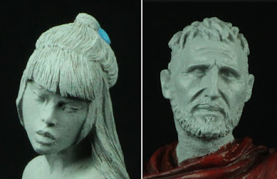
Nocturna Models resin figurines: Soum 13 Moons (left) and The Crusader (right)

If you've ever wondered why I take so long to finish my miniature painting projects, well, here's one reason amongst the many. I tend to do lots of skin tone swatches to determine the most appropriate skin colour for the miniature project in question. Granted such swatches don't account for the wet blending, feathering and layering effects of acrylic paint on primer but it does provide a fairly accurate guideline on hues that closely resemble the painting's subject matter.

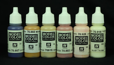
Vallejo Model Color acrylic paints under consideration for a female Japanese skin tone
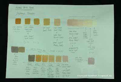
Skin tone swatches of possible hues to be used as a female Japanese skin tone
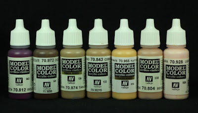
Vallejo Model Color acrylic paints under consideration for a male Caucasian/Mediterranean skin tone
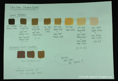
Skin tone swatches of possible hues to be used as a male Caucasian/Mediterranean skin tone


Complicating matters is the use of cool or warm shadows which depends on the predominant skin tone hue. At this stage of my research. it's highly likely I'll use cool shadows for both Katana and Bronn (see above) to counter their fairly warm skin tone in general. Regardless on the hues used, one thing for certain is that I will be using Vallejo Model Color paints exclusively to paint their skin.


And in case you were wondering just what is Westworld all about, do check out the trailer above. I leave you with my two favourite lines/phrases from the Westworld series so far, both incidentally uttered by another character Bernard Lowe to Dolores Abernathy i.e. "Step into analysis, please" and "Limit your emotional affect, please". Simple yet meaningful words in globally trying times.


https://www.facebook.com/pages/FourEyedMonster/313145002078520

Thursday 20 October 2016

House Martell Knight & Warhorse [Completed]

At last after what seems like an eternity, the House Martell Knight and Warhorse is complete. It took me a while to get over the creative block hindering its progress i.e. deciding what heraldic image I wanted on the sides of the warhorse caparison. Check out the photos below for the finished project.

House Martell Knight and Warhorse [Completed]
A Games Workshop Bretonnian Knight miniature was used for this paint job conversion project

Main colour scheme comprised analogous hues such as yellow-orange, yellow and yellow green. Things were intentionally kept as simple as possible in keeping with the other knights/warhorses in this Game of Thrones miniature painting project as can be seen in the very last photo of this post. 

Analogous colour scheme comprising yellow-orange, yellow and yellow-green
Back view of the House Martell Knight and Warhorse
Freehand painting of the sand snakes were meant to complement the 'curvy' nature of the miniature

In assembling the Games Workshop Bretonnian knight for use as a House Martell knight/warhorse proxy, I tried to include parts that had elements of a curve in it. Initially, this was to tie in with the eight bastard daughters of Prince Oberyn Martell so if you think about it, it was actually a no-brainer to use a snake design as the freehand painting subject. Its just that I wasn't too happy about the type of snake design to put on the warhorse caparison before finally settling on the one you see here.

Each and every part during the assembly process was chosen with curves in mind ...
... curves ... sand snakes ... dynamic motion ... you get the idea
Front view of the House Martell Knight and Warhorse

360 view of the House Martell Knight on a Warhorse
For a 360 degree view of the House Martell Knight and Warhorse - essentially a Bretonnian Knight painted in the colours of a noble house in the land of Westeros as described in the Game of Thrones books - please see the YouTube video below. For other videos, please visit my YouTube channel FourEyedMonster Miniatures. Be sure to choose the high definition (HD) option for the best view.


My painting skills have improved a little to the extent that I might be more comfortable attempting to paint freehand motifs on the warhorse caparison. Unfortunately that's something I cannot do in this project because the other warhorses in my Game of Thrones project only have four large heraldic images on their sides. Doing small repetitive designs on the whole caparison now would make the newcomer to the bunch completely out of place. Freehand motifs will have to wait for another day.   

Other knights of Westeros from left to right: House Arryn, Baratheon, Lannister and Clegane

With the completion of the House Martell Knight and Warhorse, I'm left with only three more miniatures from the Games Workshop Bretonnian Knight set. Two are already spoken for i.e. House Stark and House Targaryen so that leaves one more 'lesser' noble house of Westeros that I can paint. With House Tyrell practically wiped out and House Greyjoy warriors more comfortable in the sea than land, that leaves me with two very minor houses with larger-than-life characters. It's a toss-up between Brienne of House Tarth and Lady Lyanna of House Mormont. Decisions, decisions.

http://shireworks.blogspot.com/https://www.facebook.com/shire.works

Friday 14 October 2016

House Martell warhorse [WIP - caparison and shield with heraldric symbols]

Using Faber-Castell Polychromos artist-grade colour pencils to outline my freehand paintings has been a game changer for me. These are arguably the best oil-based colour pencils that you can get and more significantly they have been used on top of acrylic paints in traditional art forms. Perfect for my purpose which is to roughly outline the design that I want to paint freehand, on a miniature.  

Symbol used to represent the Sand Snakes of Dorne
Vallejo Model Color paints used for the heraldry/symbol: Read Leather, Amarantha Red and Light Orange

After outlining a snake symbol in pencil (I forget which colour I used but it was of a brownish orange hue) I then proceeded to fill the simple design using Vallejo Model Color acrylic paints. To ensure a muted look to the heraldic sand snake symbol, I used more of the darker hues in a Red Leather-Amarantha Red-Light Orange triad. The overall colour combination was muted enough that I didn't need a wash to blend the freehand symbol into the warhorse's caparison.  

To reinforce the warhorse's dynamic pose - 'sand snake' symbols were chosen over the static 'spear over sun'
Sand snake symbols had opened mouths to symbolise aggressiveness

Key to making this work was the muted hues of the sand snake symbols. It avoided a iron-on-patch look which would've ruined the look of the warhorse's caparison. While working on the sand snake symbols I then realised what has been bugging me for the longest time about the House Martell coat of arms (spear through sun) on the shield. I had finished the freehand painting for this quite a while ago but was never really satisfied with what I achieved. Although I liked the design, the colours 'popped' too much. Then it occurred to me the colours needed to be muted. I did just that and the results are shown in the last two photos of this post. It looks much better in my humble opinion. 

House Martell warhorse was painted with an analogous colour scheme in mind
I needed greens in the warhorse's colour scheme and it came in the form of grass

Real life sand snakes do not have such prominent heads as you see before you in the freehand painting that I did on the warhorse's caparison. However, this is one of the times when creative license had to override reality. As such, I made the sand snake's head larger ... almost serpent like. It's opened mouth/stuck out tongue look was meant to symbolise aggressiveness. Imagine if you will Professor Severus Snape barring his teeth and hissing at you. That kind of aggression.

Creative license was taken to make the sand snake symbol look more intimidating i.e. a bigger head
Another piece of creative license was maintaining a darker hue of orange versus those seen on TV

An over-saturated spear-through-the-sun symbol which I had done earlier would've looked totally out of place with the new more muted sand snake symbols. As mentioned earlier, I had muted the colours of the House Martell coat of arms on the knight's shield. The before and after freehand paintings can be seen below with the 'after picture' on the left and 'before picture' on the right.

New muted House Martell coat of arms (left) vs the original over-saturated spear-over-sun symbol (right)

Macro camera shots, as always, can be a bit misleading as it takes away the scale of difficulty (pun unintended) in painting on small surfaces. Granted these Games Workshop Bretonnian Knight miniatures aren't that small in overall size but they are still small enough to make painting freehand on them a challenge. Shown below is the warhorse and shield placed next to a five sen coin and paper clip respectively. Painting freehand on the shield was a particularly daunting experience.

No Knight of Dorne in attendance yet but here's the warhorse and shield in a scale comparison shot

I'm so relieved the creative block that has plagued me in the painting of this miniature is finally over. Having semi-completed miniatures on the display shelf can be an eyesore yet I continue this practice in the hope that (a) I finish what I start and (b) I don't start what I can't finish. Hah! That's working out well for me ... not. But the soon-to-be-completed House Martell Knight/Warhorse miniature conversion will at least be one less eyesore on my shelf. One more step towards a display cabinet that's full of wonderfully (ok, ok ... fairly well ... hmmm let's settle for they don't suck ... too badly) painted miniatures. Cue music, Imagine by John Lennon ... one miniature painter exiting stage left.  


Friday 7 October 2016

Game of Thrones Bronn (WIP - House Lannister Heraldry) aka 54 mm Nocturna Models The Crusader

Bronn - not unlike the Nocturna Models 54 mm The Crusader figurine itself - can be pretty plain. What gives Bronn character is not fancy clothing but his semi-weather-beaten facial features. And this puts a lot of pressure on a painter to do a good job on the face or see the whole piece fail. To hedge my bets, so to speak, I decided to spread the 'wow factor' of this miniature to include a fairly detailed freehand painting of the House Lannister heraldry on Bronn's armour. As far as I know Bronn never wore armour with the lion symbol on it so this was a bit of artistic license on my part.

Game of Thrones - Bronn the Sellsword with House Lannister's heraldry on his armour

My search for a suitable tool to sketch initial outlines of freehand paintings is finally over. And the solution was right under my nose too. As part of my new journey into coloured pencil portraits, I had bought Faber Castell Polychromos as well as Primacolor Premiere professional artist grade coloured pencils. Polychromos pencils are highly pigmented with a hard oil-based core - a combination which makes it easier to sketch outlines on painted figurines. While Prismacolor pencils are also highly pigmented, they are wax based with a softer core. So I used a cream coloured Polychromos pencil to sketch the initial outline. Any excess pencil residue was carefully removed using a kneaded eraser.

Polychromos oil-based colour pencil (cream) and a kneaded eraser
Freehand Painting - Stage One: Initial outlines drawn using the Polychoromos colour pencil
A more detailed symbol was then drawn with any excess pencil residue removed using a kneaded eraser

My previous attempt at painting the House Lannister heraldry had ended up being too yellowish. So for this effort, I used less yellow and more of the dark orange hues. Any yellows used were mixed with light orange to effectively tone down the overall brightness of the freehand symbol.  

Freehand Painting - Stage Two: Basecoat with Amarantha Red
Dark basecoat colour makes it easier for the subsequent lighter colours to be layered on

I started with a basecoat of Vallejo Model Color Amarantha Red followed by a midtone comprising a mixture of Amarantha Red and Light Orange. The darker basecoat made layering on the lighter hue easier and allowed for a more consistently smooth coverage of the lighter hue.

Freehand Painting - Stage Three: Midtones with a mixture of Amarantha Red and Light Orange
Lion symbol begins to take shape as lighter hue contrasts better against the armour

From there on out, every subsequent layer of a lighter hue were painted with some of the earlier darker hue showing through. This was so that the symbol had more depth to it. In this case, it meant the Amrantha Red showing through the Amarantha Red/Light Orange layer which itself showed through the pure Light Orange layer. Effects were subtle to prevent a too 3D'ish looking symbol.

Freehand Painting - Stage Four: General highlights with pure Light Orange
Light orange was layered in thin layers with the midtone colour showing through

Then, I lightly layered the final highlight at the very edges of the lion symbol using a Light Orange/Flat Yellow mix. Again, the effects were kept subtle to prevent a too 3D'ish symbol that looks like an ironed on patch. Lastly, an eye was painted using the Amarantha Red/Light Orange mix.

Freehand Painting - Stage Five: Extreme highlights on edges with a Light Orange/Flat Yellow mix
Lastly, an eye was painted in with a darker hue - Amarantha Red/Light Orange mix

Dark creases on the armour were left untouched as a stylistic choice. Moreover, I felt that it avoided the patched on look the symbol would have took if I painted over the creases. An alternative would be to paint darker hues on the creases - perhaps a mix of Amarantha Red and either an orangey red or reddish brown. This is something I might still do, if only to reduce the width of the dark creases. 

Nocturna Models The Crusader 54 mm figurine aka Bronn proxy [work-in-progress back view]

My efforts at painting male skin tones still lags far behind female ones as I tend to paint more of the latter. As such I've decided to put any further progress on hold until I've sufficiently researched and experimented with a suitable skin tone for Bronn. I can only hope that this temporary halt will not drag on for an eternity as it seemingly has for my other Game of Thrones project i.e. House Martell Knight/Warhorse proxy using Games Workshop minis. Speaking of which, using the Polychromos pencil to outline a design for freehand painting has unstoppered the creative block that has been hindering the Martell proxy's progress. Just like that ... after so long! I'm excited to have finally found the inspiration to finish this long delayed project and hope to share the results with you ... soon.


http://shireworks.blogspot.my/p/nocturna.html
Related Posts Plugin for WordPress, Blogger...