House Martell's heraldry is that of a brownish red sun pierced by a yellowish gold spear on an orange field. Adapting this simple heraldry for miniature form was fairly straightforward although some modifications were needed to spice up what is essentially a very boring design. For reference, I used a photograph of a House Martell banner on the set during the filming of a
Game of Thrones episode.
 |
| Freehand painting of the House Martell heraldry on a 28 mm scale shield |
 |
| Design for the House Martell heraldry was based on a banner motif found on set |
 |
| Steps (four out of five) involved in adapting the House Martel heraldry for miniature form |
Due to the scale involved (heroic 28 mm), I kept the heraldry design as simple as possible. In addition, I tried breaking it up into basic steps, each building upon the previous one. As seen above, I started with a simple circular shape and followed up by adding primary and secondary flames to the sun before capping it off with a diagonal spear.
But if you observe the knight's shield closely, you will notice a lighter shaded line-painting of a circle on the edges of the circular shape. This was necessary to maintain the illusion of a round sun. So essentially this is a five step process.
 |
| House Martell Knight [Completed sans warhorse] |
 |
| Dark brownish reds of the heraldry help create some contrast in the overall colour scheme |
 |
| With the knight completed, now all that's left is the freehand painting of the heraldry on the warhorse |
Having finished the freehand painting of House Martell's heraldry on the knight's shield, I must admit I'm having second thoughts as to whether the same symbol would work on the warhorse's caparison. Firstly, it would be difficult to account for the natural folds on the caparison. Secondly and more importantly, it might look too boring. With that concern in mind, I'm toying with the idea of using a motif of a sand viper's head instead; not unlike the one you would find on the
Dodge Viper. Nothing is finalised at the moment because a) I'm riddled with indecision and b) I haven't yet figured out how to design a cool viper motif. Just as you are, I'm truly sick of the sight of this yet unfinished House Martell knight/warhorse. But on the other hand, rushing through this last bit will inevitably ruin it.
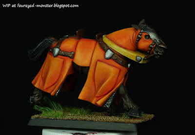 |
| Latest progress on the warhorse invloved the completion of its base |
 |
| Bright green grass was added to contrast the orange hues on the warhorse |
As I am no where near deciding what House Martell design/motif/logo to actually put on the warhorse, I decided to base it first. Nothing fancy. In fact it pretty much looks the same as all the other bases for my
Game of Thrones knights/warhorses so far. Only slight variation is that it might have had much more bright green grass glued to it than normal. Green is a great complementary colour for orange and I took full advantage of this fact when gluing on the grass. I was planning to finish the whole miniature by this post but it wasn't meant to be. Hopefully it will all turn out well in the end.


.jpg)

Terrific job on the yellows/orange colors, and a great idea to work on House Martell's heraldry...
ReplyDeleteThanks Phil ... though I must admit that the House Martell heraldry is pretty boring and it was hard to remain inspired enough to finish painting the first freehand symbol on the knight's shield.
DeleteAbsolutely wonderful, i can't wait to see it finished!
ReplyDeleteGrazie Luca! Trying very hard (and I think I'm failing) to remain inspired to finish the piece. Things were made worse when I accidentally spilled half the bottle of my favourite Vallejo Orange. :(
DeleteOh my goodness me, that is stunning work!
ReplyDeleteYou are very kind Michael. Thank you!
DeleteSo good and so orange - which is appropriate for Halloween!
ReplyDeleteHey I didn't even think of that. It is a Halloween kind of orange.
DeleteThanks Zab! :)
Cool. You make it look so simple! I like it!!
ReplyDeleteIt's as simple as it looks. Really. The heraldry looks a bit too simple in fact. Which is one reason why I'm trying to think of a better heraldry design for the horse. So far I'm failing miserably and it looks like I have to paint the rest of the heraldry like I did the shield.
DeleteLooks great, Kuan. The orange really pops.
ReplyDeleteThank you Finch. I love the Vallejo oranges.
DeleteBad news is I spilled mine (practically half the bottle as I didn't notice the cap had come off) and have no budget for a new one at the moment. :(
Beautiful work F.E.M.! The orange really glows dude!
ReplyDeleteMany thanks Bob. As repeated ad nauseam in the above comments. I had spilled my favourite Vallejo orange and have no budget for a new one. If there is ever a time for a grown man to cry ... this is it ... I was practically bawling my eyes out ... mentally of course.
DeleteGreat colours and the shield looks amazing!
ReplyDeleteThank you very much Simon. :)
Delete