Saturday 31 October 2015

Adapting House Martell heraldry for miniature form

House Martell's heraldry is that of a brownish red sun pierced by a yellowish gold spear on an orange field. Adapting this simple heraldry for miniature form was fairly straightforward although some modifications were needed to spice up what is essentially a very boring design. For reference, I used a photograph of a House Martell banner on the set during the filming of a Game of Thrones episode.  

Freehand painting of the House Martell heraldry on a 28 mm scale shield
Design for the House Martell heraldry was based on a banner motif found on set 
Steps (four out of five) involved in adapting the House Martel heraldry for miniature form

Due to the scale involved (heroic 28 mm), I kept the heraldry design as simple as possible. In addition, I tried breaking it up into basic steps, each building upon the previous one. As seen above, I started with a simple circular shape and followed up by adding primary and secondary flames to the sun before capping it off with a diagonal spear. But if you observe the knight's shield closely, you will notice a lighter shaded line-painting of a circle on the edges of the circular shape. This was necessary to maintain the illusion of a round sun. So essentially this is a five step process.

House Martell Knight [Completed sans warhorse]
Dark brownish reds of the heraldry help create some contrast in the overall colour scheme
With the knight completed, now all that's left is the freehand painting of the heraldry on the warhorse

Having finished the freehand painting of House Martell's heraldry on the knight's shield, I must admit I'm having second thoughts as to whether the same symbol would work on the warhorse's caparison. Firstly, it would be difficult to account for the natural folds on the caparison. Secondly and more importantly, it might look too boring. With that concern in mind, I'm toying with the idea of using a motif of a sand viper's head instead; not unlike the one you would find on the Dodge Viper. Nothing is finalised at the moment because a) I'm riddled with indecision and b) I haven't yet figured out how to design a cool viper motif. Just as you are, I'm truly sick of the sight of this yet unfinished House Martell knight/warhorse. But on the other hand, rushing through this last bit will inevitably ruin it.

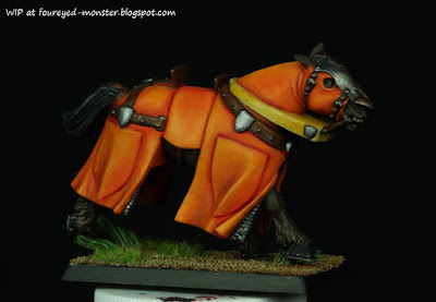
Latest progress on the warhorse invloved the completion of its base
Bright green grass was added to contrast the orange hues on the warhorse

As I am no where near deciding what House Martell design/motif/logo to actually put on the warhorse, I decided to base it first. Nothing fancy. In fact it pretty much looks the same as all the other bases for my Game of Thrones knights/warhorses so far. Only slight variation is that it might have had much more bright green grass glued to it than normal. Green is a great complementary colour for orange and I took full advantage of this fact when gluing on the grass. I was planning to finish the whole miniature by this post but it wasn't meant to be. Hopefully it will all turn out well in the end.


http://shireworks.blogspot.com/https://www.facebook.com/shire.works

Friday 23 October 2015

Ork Painboy of the Bad Moonz Clan [Completed]

Each and every W40K ork that I paint seems guaranteed to be a time sink. So it was with the Ork Painboy that I started working on three months ago. After hours and hours of trying to bring the many small details too life, I pronounce this latest addition to the Bad Moons clan finished. At least as finished as any miniature can be, considering none in my collection were given a protective anti-paint chip coat, which in turn leaves them open to paint modifications in the future. I guess that's a way to mollify myself with the thought that I can always come back to them when my skills improve.   

Games Workshop Ork Painboy [Completed]
Spin the doctor and he would move in a kaleidoscope of colours
Insane amount of details equaled many hours of painting put in
Colours are a mishmash of yellow-green, yellow, orange, red, red-violet, blue-green and neutral hues   

In a departure from the normal colour schemes expected of a Bad Moons Ork (or is it?), I went colour crazy on the Painboy. His colour scheme comprised a mishmash of yellow-green, yellow, orange, red, red-violet, blue-green and neutral hues. I was curious if such a variety of hues could work or would it just overwhelm the senses. Looking at the finished piece now I think it kinda does.  

Yellows of the Bad Moons Clan were limited to the bosspole and loin cloth
Temptation to splash blood everywhere on the Painboy's buzz-saw weapon was high ...  
... but in the end, only a dab of blood made it to a blade attached to the buzz-saw
This Ork Painboy has one of the most colourful schemes I have ever attempted

The Ork Painboy is actually part of a set with its other half being a Grot Orderly which I completed a year ago. Both complement each other colour scheme wise and are a welcome addition to my fledgling ork army. It will be a while before I return to painting orks though as I plan to move on to Chaos in my Games Workshop-related miniatures project. A break from green skin will do me good.

Games Workshop Ork Painboy and his Grot Orderly (front view)
Games Workshop Ork Painboy and his Grot Orderly (back view)

Perhaps it's fitting and ironic that my next Games Workshop miniature will likely be an ode to Nurgle seeing that this piece is dedicated to healing. More on that project in the coming weeks. Meanwhile the hazy conditions just won't go away. It's getting worse. A news report alleges that the carbon released from the Indonesian fires causing the haze have now exceeded the emissions from the entire US economy. Imagine that! In this day and age where war violence dominates global news, this environmental horror show seems to have largely escaped the attention of the rest of the world. I shudder to think the price Earth is going to pay for this tragedy that's slowly unfolding before us.

http://shireworks.blogspot.com/https://www.facebook.com/shire.works

Thursday 15 October 2015

Nickelodeon Best Friends [WIP - SpongeBob Skin Tone]

Having to continuously paint miniatures with many small details can be mentally exhausting at times. That's one reason why I always try to vary the type of miniatures in my project pipeline. It can be very liberating to not worry about incorporating freehand designs into your work, or about bringing out the details on a miniature through fine detail painting. Sometimes I just want to apply layer after boring layer of paint (of a single hue) with minor considerations towards shadows and highlights. There is something to be said for the repetitive nature of applying stroke after stroke of thin (and diluted) layers of acrylic paint onto a miniature which has both a calming and de-stressing effect.

SpongeBob SquarePants, work-in-progress on his skin tone
Baaa Baaa Baaaaa ... a laugh to end all laughs

One of the best models I have for this purpose is the Nickelodeon Best Friends kit comprising SpongeBob SquarePants and Patrick Star, of which the latter has been completed thus far. After a lengthy seven months in cold storage, this mini-diorama was pulled out and dusted off for work to continue, starting with SpongeBob's skin tone. At first glance, it does seem as if not much work has been done. Nothing could be further from the truth. Believe you me, many hours were spent patiently applying ever lighter hues of yellow to create a smooth texture on his skin. Yellow is a notoriously difficult colour to work with especially when armed with only a normal brush of the 'non-air' variety. 

Light yellow highlights on all edges of the sponge
Olive green shadows inside the sponge holes
After obtaining a fairly smooth semi-flat yellow on the body, both shadows and highlights were subtly applied to create more depth while maintaining the flat cartoon look of the TV show in the Nickelodeon channel. Bright yellow was mixed with white to form the highlight colour which was then applied to all edges found on SpongeBob. Meanwhile, a short gradation of olive green was used as shadows in the sponge holes. Olive green was preferable to brown because it looked less dull.  

Nickelodeon Best Friends Diorama, work-in-progress with Patrick completed ...
... and SpongeBob with only his skin tone done so far

Sadly, I don't have many figures of this ilk in my collection. Don't  get me wrong. I still love painting miniatures with wonderfully sculpted details. But there are times when one needs to enjoy the simpler forms of the hobby and the Nickelodeon mini-diorama was the perfect go-to piece in this case. I'm loving how this piece is coming together and hopefully will be able to finish it before the year-end. Now if only someone could get SpongeBob's high pitched laugh out of my head. Baaaaaaaaaaa ...

Thursday 8 October 2015

Nocturna Models Enchantment [WIP - Base]

Painting cobblestones, for some reason, has always been on my bucket list of painting must-do's. The chance to tick this item off my list finally came in the form of the 70 mm Nocturna Models Akelarre Enchantment figurine's base. Details on the base is excellent as the shapes of the individual pieces of cobblestone are random enough to prevent it from looking like just another cookie cutter design.  

Akelarre Enchantment (as a proxy for Daenerys Targaryen) work-in-progress, cobblestone base
Daenerys as she looks now with a lot more hours pending on her head, eyes, lips, hair and accessories

One key consideration when painting the cobblestone base was to keep things as simple as possible. In other words, the steps involved in completing the base had to be minimal and easy to carry out. To kick things off, I applied a black wash (Citadel Badab Black/Nuln Oil) on the base which not only filled out all the crevices but also helped define individual cobblestones for easier painting.  

Step 0: Base primed with Tamiya Fine Surface Primer
Add black wash to the base ...
Step 1: Base after a few layers of black wash

To prevent the base from taking centre stage, as it were, I kept the colour scheme dark and fairly dull with grey being the dominant colour. Even some of the blues had hints of grey while others had a greenish tint to tie in with the light turquoise colours on her dress. To further dull (and dirty up) the colour scheme, another layer of black wash was applied after the cobblestones were painted.

Colour scheme for cobblestones comprised primarily of greenish- and greyish-blues as well as greys
Step 2: Base after individual tiles are randomly painted with the above colour scheme

As a finishing touch, I glued on tufts of grass in the crevices at strategic points on the cobblestone base. This I did because the base looked a bit bare as it is. Dead grass as opposed to fresh green grass was chosen with the overall dull colour scheme in mind. Moreover, having healthy bright green grass growing in the crevices of a cobblestone street didn't make sense if realism was the target.

Glue on some winter/static grass on the cracks between the cobblestones
Step 3: Base after finishing touch of the glued-on grass

Based on the second photo from top, it kinda looks like there doesn't seem much left to do for the Nocturna Models miniature. But nothing could be further from the truth. For starters, I will have to resculpt the two head ribbons (not shown here) to be attached to her headgear so that it looks dynamic i.e. as if the ribbons are waving in the air and paint them. In addition, there is more work to be done on her headgear itself as well as her hair, eyes, lips and the many tiny clothing accessories (e.g. necklace on her neck, tiny metal chain on her right thigh, etc). In short, she is far from finished.

http://shireworks.blogspot.com/p/nocturna.html

Thursday 1 October 2015

Ork Painboy [WIP - Weapons and Head]

Capitalising on momentum generate by a brief respite from the haze, work on the Ork Painboy continued at a fairly steady pace. This saw me completing the paint job for his head and both his weapons which means the ork is about 90% complete. Not too bad considering the haze's return. 

A blood stained face mask, a head lamp with OSL effects, a metal helmet and two teeth completes the Ork head 

Painting the Ork Painboy's head involved going against my first colour choice for his face mask. I had wanted to go with the clichéd off-white/light beige look that seems to blend pretty nicely into the overall colour scheme (at least in my mind). Instead, I tried using light sky blue/turquoise for the mask. Partly to inject more colour into the overall piece and partly to stray from more well trodden paths, this choice will either be a brilliant choice or a 'what was I thinking' moment. Time will tell.  

Dull metallic colours of the buzz-saw, blades, gears, heat sinks, exhaust is contrasted with the blood stain, red/yellow stripped poison container and the tube/vial containing grape juice ... yes grape juice

Something I have probably repeated ad nauseam is the fact that I hate to paint metals. I was so bored by the dull metallic colours that I went ahead to paint a red and yellow stripped poison container (red and yellow because it reminded me the coral snake) as well as a tube/vial containing grape juice (more on this later). On hindsight, maybe this wasn't particularly clever of me but I'm still hoping that it will all come good in the end. It simply has to because I'm too darn lazy to repaint that small detail.

Liquid in a syringe: Grape juice is to Orks as prune juice is to Klingons

I was more at home painting his other 'weapon' which was less about the metal bits and more about the liquid that was contained inside the syringe and tube. Why purple/red-violet? Well, I was thinking in lines of a harmonious tetrad colour scheme based on the colour wheel. It's actually grape juice which has been known to have restorative effects on orks. But don't bother looking this up in the Games Workshop codexes because it's not canon. It's just something I came up with by referencing another violent alien race i.e. Klingons who seem to love prune juice. You gotta be a Trekkie to get it.

Purple (red violet to be exact) is the last major colour in the Ork Painboy's colour scheme

All that remains now is to glue the head on, build/paint up a base and put some final touches to ensure the overall colour scheme is in harmony. But as I'm wont to do right before a project is completed, the Ork Painboy will probably be put into a short 'gestation period' of about a week so that when I come back to it I will be able to see the overall colour scheme with fresh eyes. So there will be a short diversion to another project before I quickly return with the Ork Painboy's unveiling. Until then, here's wishing you sunny skies and smogless air.


http://shireworks.blogspot.com/https://www.facebook.com/shire.works
Related Posts Plugin for WordPress, Blogger...