Monday 30 June 2014

Putting the red in Red Riding Hood

Of all the colours on the Nocturna Models Le Petit Chaperon miniature, red is to me the most important. Henceforth, every other colour I put on her will need to complement the shade of red I have painted on the hooded cloak. Targeting a hue between an intense bright red bordering on orange and an earthy brown red, I sought a middle ground that hopefully sees the red 'pop' without being too overpowering. I will only know for sure if I have achieved this after painting the rest of her.   

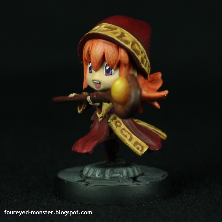
Nocturna Models Le Petit Chaperon gets a splash of red

To prevent an overdose of red I am limited the painting of this colour to only her hooded cloak, shoes and sock garters. Personally, I think painting too much red would overwhelm this miniature and make it look too one dimensional and flat. Moreover, she is Red Riding Hood not the Lady in Red.  

Other than her iconic hooded cloak, Le Petit Chaperon has red shoes and sock garters
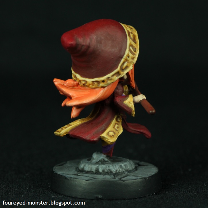
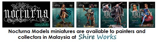
Two sides of the red cloak worn by Le Petit Chaperon

Previous blending and layering practice with red colours definitely helps as every new attempt sees smoother transitions from the shadows all the way to the highlights. It's not perfect yet but I'm getting there one layer (or is it blend) at a time. Red is a lovely colour to work with but hard to perfect.

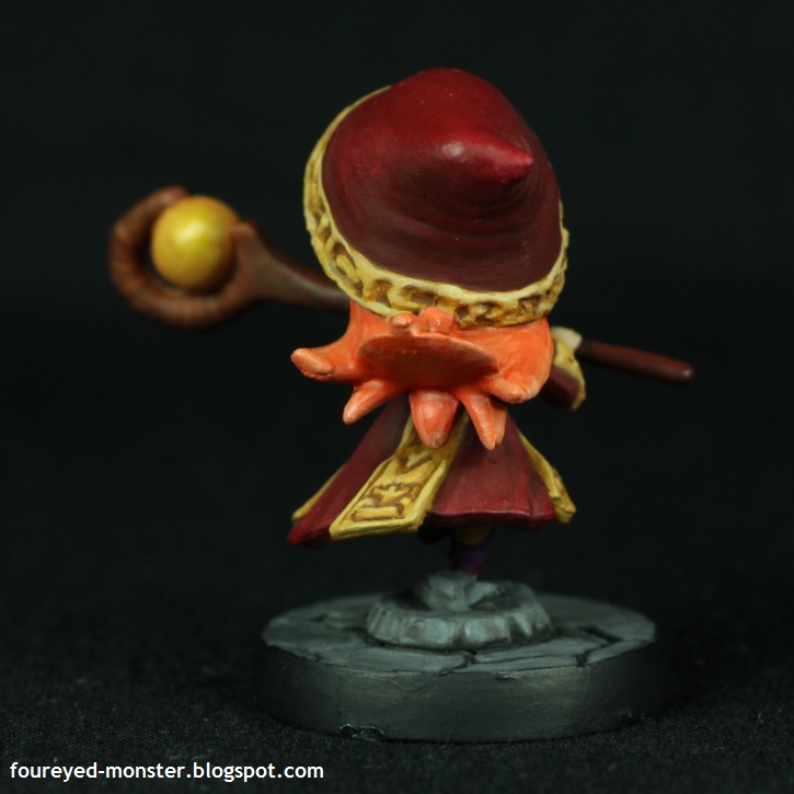
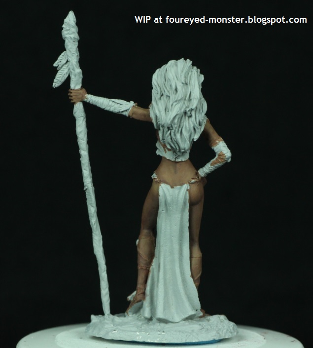
Front view of the Nocturna Models Le Petit Chaperon, work-in-progress
A dynamic sculpture of Red Riding Hood's hooded cloak made painting it a real pleasure

To enhance the reds, I used blue shadows instead of black. I was fortunate enough to get hold of a really old White Dwarf magazine (WD362 February 2010) which back then had the excellent Ask 'Eavy Metal articles, and this issue touched on the use of alternate colours as shadows for reds.

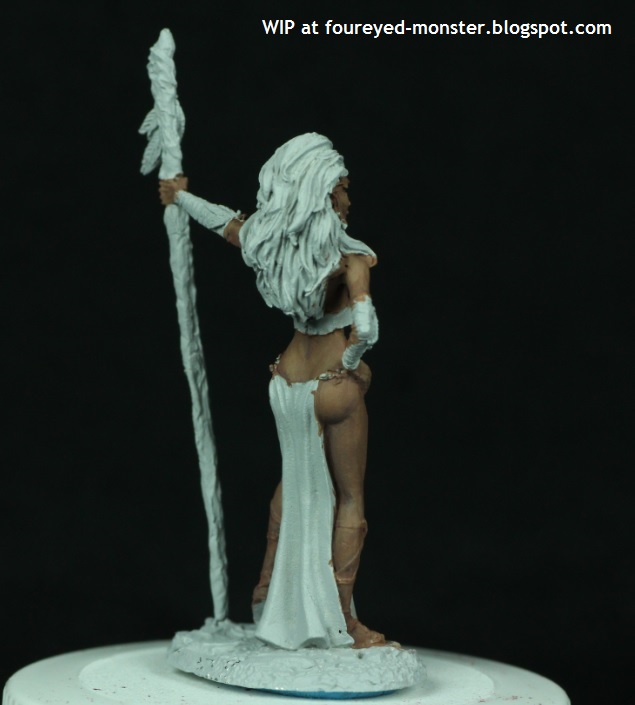
Blue shadows were used to give the reds some 'pop'
Highlights looked yellowish hence were limited lest they reduce the hooded cloak's overall redness
Best view of the blue shadows on Le Petit Chaperon's hood
Le Petit Chaperon's blouse is screaming out for a sheer fabric treatment, tastefully done of course

Meanwhile, her highlights were purposely limited to as few areas as I could get away with. I noticed that if I went crazy with the highlights, the cloak started to look more orange than red. At one stage I had to tone down the highlights with some mid-tone glaze. But that being said, there is a case to be argued for more highlights on her hood (not cloak) especially at the top most part. 

It doesn't matter if it's Prada or Bata, red shoes are always hot
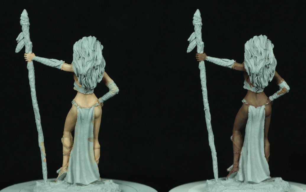
Top view of Le Petit Chaperon's hooded cloak

Also when painting the reds in Le Petit Chaperon, I changed my song playlist from its default blues setting to one with a variety of genres but still dealing with sadness and melancholy. Well it started super sad with one of my favourite country songs Stay by Sugarland but ended in an upbeat song that was released when I was still in my mid-20's (deary me I feel old) i.e. Kiss Me by Sixpence None The Richer. Both songs and the many in between set up a nice little mood progression for my painting session, transitioning from sad to happy. It never hurts to have good music to paint to! 

Jennifer Nettles and Leigh Nash both offer contrasting skin/hair colour options as well as music accompaniment

Incidentally, the lead singers of the respective music groups I mentioned namely Jennifer Nettles and Leigh Nash also offer an interesting contrast in skin and hair colours, one of which I may yet adopt for Le Petit Chaperon. I leave you with this lovely line from a Sugarland hit ... 'I need a little less hard time, I need a little more bliss'; I hope you have less of one and more of the other in your life.  

http://shireworks.blogspot.com/p/nocturna.html

Thursday 26 June 2014

Wood Elf Goddess [WIP - Dark skin tone]

My experimentation with Vallejo Model Color acrylic paints for skin tones continues with an attempt to paint a darker skin tone on another Dark Sword Wood Elf Goddess miniature. Used in conjunction with Reaper Master Series Clear Brights, the Vallejo paint recipe for dark skin is adapted slightly from a Marike Reimer tutorial found on her painting DVDs. After considerable trial and error, I managed to get reasonably close (if not exactly similar) to the paint mixtures used to create the dark skin tone. At this stage, her skin is 70% to 90% complete depending on how light I want to make her. 

Dark Sword Wood Elf Goddess, work-in-progress dark skin tone
As with her light-skinned sister, I may pain her wearing sheer fabric 
It was easier to blend smooth transitions for dark skin

I guess it should not have been any surprise to find it much easier to get smooth blends for the darker skin tone. After all, chalkiness is often associated more with lighter acrylic paint colours. I had initially planned to give the Wood Elf Goddess lighter highlights and darker shadows but stopped short as I kinda liked the dark skin tone I had painted so far. But what I like may not be good enough. 

Future touch ups could involve lightening the highlights and deepening the shadows 
Back view of the Dark Sword Wood Elf Goddess, work-in-progress skin tone
I plan to paint her hair black but choice of dress colour is yet to be decided

So while I am generally happy with the results I have achieved so far, I am still tempted to do lots more work on her skin by making the highlights lighter and the shadows darker. I think this would take it closer to the excellent dark skin tone achieved by Marike Reimer in her DVDs. But there is this voice in my head urging me to let sleeping dogs lie lest I destroy all the work I have done so far.  

Side view (right) of the Dark Sword Wood Elf Goddess, work-in-progress skin tone
Put a ring on it?

Colours used for the dark skin tone were Vallejo Model Color Pale Sand, Green Ochre, Red Beige, German Camouflage Pale Violet Brown, Mahogany Brown and Reaper Master Series Clear Brights. As the steps on mixing colours needed to paint the dark skin was implicit, I made an educated guess on the paint mixture/ratios. In brief, I used Red Beige/Pale Violet Brown/Mahogany as the mid-tone with Green Ochre and Pale Sand added for the various highlights. For shadows, more Mahogany Brown and some Oxford Blue was added. The Reaper Clear Brights were used as a red and purple (blue plus red) glaze, something that I may need to do more of when touching up the dark skin tone.  

Colours used for my attempt at painting dark skin

As with the light skin tone experiment, if you truly want to achieve the best results then you owe it to yourself to check out Marike's painting DVDs. Below are some comparisons between the light- and dark-skinned Wood Elf Goddess in avatar form. Both would require different hair and dress colours. 

Light vs dark skin tone (front view of the Dark Sword Wood Elf Goddess in avatar form)
Light vs dark skin tone (back view of the Dark Sword Wood Elf Goddess in avatar form)

So my initial foray into skin tones using Vallejo paints was a success in that they suited my style of painting which involves a combination of layering and blending fairly thinned-out paint mixtures. I almost never dry-brush unless I am working on bases. One thing's for sure, this week marks a milestone in my attempts to be a better miniature painter. Other than my new found love affair with Vallejo Model Colors, I am also getting a bit better at layering and blending. Happy times all around.

Tuesday 24 June 2014

Wood Elf Goddess [WIP - Light skin tone]

Vallejo Model Colors are the best acrylic paints I have used for skin tones by a country mile. And if used together with the Reaper Master Series paints, I feel that the sky is the limit for me from now on. It's as if the glass ceiling that's holding me back has been shattered ... perhaps a tad over dramatic I give you that but that's how it feels for me. Although this is my first attempt at painting skin tones using the Vallejo paints, the results I got are so much better than what I have ever achieved ... period. 

Dark Sword Wood Elf Goddess, work-in-progress on light skin tone
Still undecided whether to paint her blouse as sheer fabric
Side view (left) of of the Wood Elf Goddess, work-in-progress skin tones

I found it easier to achieve smoother textures even for the lighter hues which have always given me problems by turning out chalky. Well not any more, as I did not have much trouble with chalkiness when using the Vallejo Model Color acrylic paints. It was also easier to blend smooth transitions.

Vallejo Model Colors are giving me smoother textures, even for the lighter hues
Back view of the Wood Elf Goddess, work-in-progress skin tones
Subtle shadows to shape her buttock and back of knee

Any harsh transitions from light to dark that you may spot in the photos are purely my own fault as I had to quickly finish her skin tone before my paints dried up completely. In my hurry, I missed a few spots. That means I will need to do about half-an-hour to one-hour or more of blending and layering to achieve smoother colour transitions. But the big question is whether I will be able to get the same skin tones I had mixed earlier seeing that they have already dried up in this hot weather. I created a lot of mixture/ratios to obtain smooth colour transitions, and some I may not be able to recreate.

Side view (right) of of the Wood Elf Goddess, work-in-progress skin tones
Dark Sword's Wood Elf Goddess is an incredibly sculpted piece, very beautiful

In brief, the paints I used were beige red/basic skin tone for the midtone; pale sand, basic skin tone and beige red in varying mixtures for the highlights; and German camouflage pale violet brown, basic skin tone, and beige red in different ratios for the shadows. Carmine red was mixed with the midtone for the lip colour while a glaze of Reaper Clear Bright (Red) was applied on parts of the Wood Elf Goddess's body. For the correct mixture and techniques in the painting of a light skin tone, I strongly suggest you check out Marike Reimer's painting DVD. My results are nowhere near as good as hers.  

Colours used for the Wood Elf Goddess's light skin tone

Keeping her skin tone low contrast meant it was difficult for me to maintain some depth to her skin so I did the best I could. Regardless I am still happy with the results. Finishing this light skin tone experiment has gotten me all fired up to do the dark skin one. Stay tuned for that one as it's up next!

http://shireworks.blogspot.com/

Sunday 22 June 2014

A skin tone experiment using Vallejo Model Colors on a Wood Elf Goddess; in prepration for Le Petit Chaperon

Time apart from my Nocturna Models Le Petit Chaperon project is giving me some valuable insight on how to proceed with painting her colour scheme. For one, I experimented with a more earthy red hue when painting a hooded cloak (on the Super Dungeon Explore Ember Mage) to see if it suited Le Petit's purposes. Well it doesn't, as I feel Le Petit needs a brighter red to bring her Red Riding Hood persona to life. I have also fought off the temptation to quickly start painting Le Petit's skin because I first want to experiment with two skin tone recipes using Vallejo Model Color (VMC) acrylic paints.

Not one but two Dark Sword Wood Elf Goddesses in avatar form

Guinea pigs were needed for this VMC skin tone experiment and none, I feel, were more suitable than Dark Sword Miniatures's Wood Elf Goddesses in avatar form. In fact, I loved how well this metal figurine was sculpted (by Jeff Grace) that I had gotten two of her for this little experiment. One is for painting a light and rosy Caucasian-like skin tone while the other is for a more dark skin tone ala Fanny Neguesha, the wife-to-be of a particularly famous Italian footballer. It's the World Cup 2014 after all and I just had to have a footballing theme to my miniature project somehow. Don't hate!

Wood Elf Goddess primed (left) and straight out of the box (right)
Back view of Wood Elf Goddess that is primed (left) and in its original metal state (right)

Paints I plan to use for this experiment comprise almost entirely of those from the VMC line as some Reaper Master Series acrylic paints were also used on the darker skin. Adapted slightly from the two skin tone recipes created by one of my favourite miniature painters - Marike Reimer on her own how-to-paint DVD - the paints I will use are Basic Skin Tone, Beige Red, Mahogany Brown, German Camouflage Pale Brown, Pale Sand, Green Ochre and Oxford Blue (and also some Reaper Master Series Clear Brights which were not shown in the photo below). Some will be used solely for light skin, some solely for dark skin and some for both. Of both skin types, I have yet to get the correct paint mixture/ratio for the dark skin so I guess that leaves me with painting the light skin first.

A mixture of Vallejo Model Colors for a light and dark skin tone experiment

Finishing the light skin tone experiment will at least give me some idea on whether I would want to proceed painting Le Petit's skin using VMC paints. Since I won't be able to work on Le Petit's skin tone for now, I will most likely paint up the red portions in the figurine since I have made a final decision on the type of red I want to see on her. Getting the reds right will be crucial for Le Petit.

Nocturna Models Le Petit Chaperon all set for a splash of red paints

That's it for this simple little update on what I have been up to in this insanely hot and dry weather. Thanks for checking up on my hobby shenanigans and do have yourself a good weekend!    

https://www.facebook.com/shire.works

Wednesday 18 June 2014

Super Dungeon Explore Fig.3: Ember Mage

This fiery little character from the Super Dungeon Explore board game took longer than expected because I had yet another Murphy's Law moment and struggled mightily to paint the Ember Mage's eyes. I repainted her eyes many times and each time I tried to fix a previous mistake I ended up making things much worse. Averaging 34°C, the warm El-Nino weather wasn't much help as my paints were drying up faster than usual even on a wet palette as well as on my brush.   

Super Dungeon Explore Ember Mage
An angled top-down view of the Ember Mage as well as close-ups of her staff

Finishing her eyes was just one part of my final push for this Super Dungeon Explore board game piece, as I also finished painting her staff and dimly glowing ball (at least that's what I had envisioned it to be) attached to its end. I did a little bit of object source lighting at the end of the staff to reflect the dimly lit ball. For the Ember Mage's staff, I tried to paint it to look like mahogany wood. 

Colour scheme comprised largely warm colours with some cool purples for contrast
My favourite photographic angle of the Super Dungeon Explore Ember Mage
Super Dungeon Explore Ember Mage, side view (right)

Painting the Ember Mage's eyes purple went surprisingly well. Initially I was afraid it would clash badly with the orange hair but I guess it helped that her clothes were also purple (of a darker shade).

A hint of purple leggings amidst all the warm colours
Super Dungeon Explore Ember Mage (back view)
Red, orange, yellow and gold ... warm colours for an Ember Mage

Having the usual dull and neutral grey on black base was appropriate seeing that the focus was going to be on the Ember Mage anyway. I was pretty sloppy with the base's paint job as I just wanted to finish the miniature at that point. In the end, I was happy just to keep the paint job clean.

Super Dungeon Explore Ember Mage (side view, left)
Say I am cute or get a fireball in the face

Although I haven't decided which Super Dungeon Explore hero character to paint next, it will most likely be one without any red/orange in it so the Royal Paladin and Glimmerdusk Ranger are prime candidates. Thanks for following my progress of the Ember Mage from start to finish and I hope you have enjoyed watching her come to life through paint. Till my next update, be well and happy!

Related Posts Plugin for WordPress, Blogger...